Chart patterns are crucial in technical analysis, but they may be challenging to grasp. A “chart pattern” is a shape that is used to anticipate future price movements. You may get a significant advantage in the markets by recognizing these technical figures that repeat themselves.
Using chart patterns in the technical analysis does not guarantee that a market will move in the predicted direction; instead, they serve as a signal of what may happen to the price of an asset.
Let’s discuss the top three crypto patterns to level up your profit.
What are chart patterns?
These figures refer to price patterns that appear on a chart. To gauge the market’s mood, market participants look for a series of patterns that may seem random at first glance. Technical indicators and candlestick patterns augment these insights while making trading decisions.
Trend lines, which connect successive highs and lows on a chart, provide the basis of the majority of chart patterns. However, a trend line might be a psychological barrier if the price has previously responded to it or many volumes when the price approaches the trend lines.
A chart pattern anticipates one of two things: whether or not market participants construct them with the belief that they will occur and whether or not these expectations are met.
- The price of a crypto asset would resume its upward trajectory after a brief period of consolidation or correction.
- As soon as it becomes possible for a reversal to take place, the price of a security may reverse and move in the opposite direction of its existing price trend.
Fortunately, you don’t have to be a crypto expert to recognize these tendencies. Instead, rookie and experienced investors alike might benefit from other straightforward chart patterns.
Triangles
Let’s talk about these popular technical figures in trading.
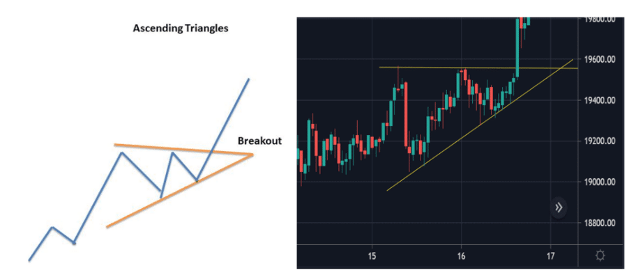
Ascending triangles
They are bullish continuation patterns that indicate an uptrend will continue. The swing highs and lows may form a horizontal resistance line and an ascending trend line as support. Once the obstacle has been overcome, the upward trend will continue.
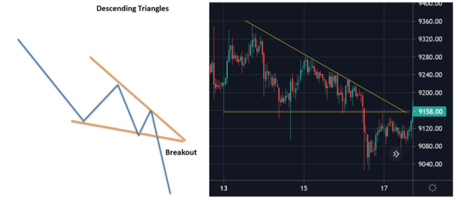
Descending triangles
There are similarities between the ascending triangle and the descending triangle patterns. The only main difference is a bearish continuation pattern created during a decline. Prices tend to drop and breakthrough support when sellers control the market. Indicators of falling triangles are the horizontal support and resistance lines. Downward movement occurs as soon as support for a trendline is broken.
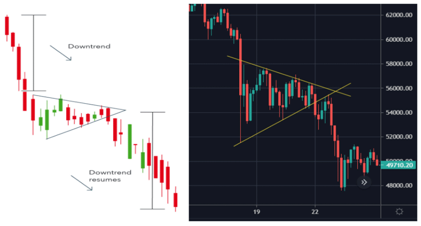
Symmetrical triangles
Two trend lines intersect in the center to produce symmetrical triangles, a chart continuation pattern. However, the symmetrical triangle pattern may be bullish or bearish depending on the market. The market will usually continue in the same direction as the major trend when a continuation pattern is developed.
However, the market might move in either direction without a clear trend after a breakout from a triangle formation. Using the symmetrical triangle in turbulent markets where it is impossible to forecast the direction in which an asset’s price will move is a good idea.
Wedges
Now comes the wedges that are also considered as accurate price action patterns.
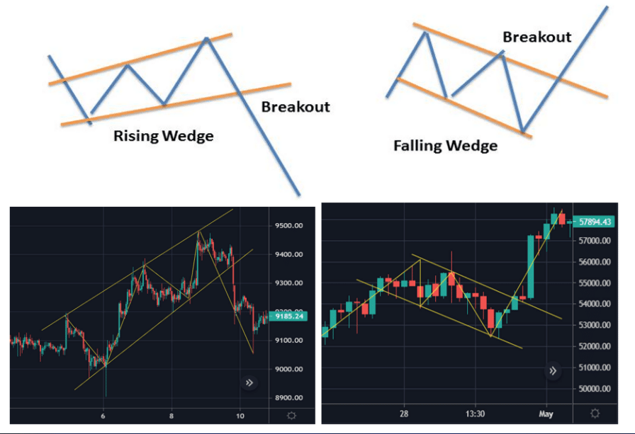
Rising wedge
In the case of this pattern, two converging support and resistance lines are formed. All support and resistance lines should rise to form a rising wedge, but only the support line should be steeper.
Breakouts are common in wedge patterns, such as H&S, triangular flags, and flag-shaped triangles. In the case of rising wedges, this breakout is often negative.
It’s possible that ascending wedges will emerge in a rising or declining market.
- In an uptrend, market participants revisit the positive trend in an uptrend, which is a good sign.
- There is a slight reprieve during bear markets before the bear market begins again.
At first glance, a rising wedge seems bullish. Indeed, the previous bottom is more significant than any subsequent peak. It’s vital to keep in mind, too, that the upswings are becoming shorter and shorter as time goes on. It is a sign that a pessimistic attitude is gaining traction in the markets. Or reforming, in the case of a continuation.
Anyone with a long position may be tempted to close it out quickly to limit their losses when the market goes below its rising support line. People who have been waiting to short the market may now do so. As a consequence, a selling frenzy ensues, pushing prices rapidly down. Any market that draws technical traders, such as indices, FX, and stocks, may display rising wedges.
Falling wedge
This pattern is formed when a market consolidates between two converging support and resistance lines. In falling wedge formation, the support and resistance lines must both point downwards, with the resistance line being steeper than the support.
This pattern is the opposite of the rising wedge in its shape and appearance. Thus, breakouts are prevalent; rising wedges lead to bearish swings, while falling wedges lead to bullish advancements.
- It is just a matter of time until the long-term trend returns when a market rises.
- When a market declines, it indicates that traders are reconsidering their pessimistic wagers.
It may seem counterintuitive to interpret a declining market as a sign of an approaching bull surge, similar to the rising wedge. However, it’s essential to keep in mind that the negative moves are becoming increasingly brief in this situation. It is a sign that a bullish mood is taking shape or has already begun to regenerate.
Head and shoulders
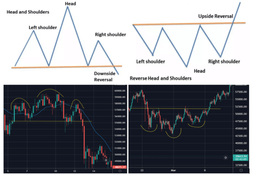
The middle peak is the most prominent in this pattern, followed by two smaller ones on each side. The H&S is one of the best reversal patterns. An investment’s value plummets to its initial level after reaching an all-time high.
This pattern has now been established. A fresh record high is set before prices fall back to their starting point. Before the price lowers back to the beginning point, it reaches a third high that is lower than the second. We know we’ve entered a bear market when prices and volume both break through the baseline.
The H&S pattern is generated when two smaller peaks follow a prominent peak on each side. To foresee a change in the market’s direction, traders employ head and shoulders patterns. The first and third peaks are usually smaller than the second, but they all return to the same level of support, or “neckline,” in most instances. According to this scenario, a bearish decline will begin if this third high falls below the support level.
Upsides and downsides
| Upsides | Downsides |
| These price action patterns are quite accurate in determining the price movement. | It is hard to determine the exit points with these patterns. |
| These figures help detect the trend reversals and phases of the existing trends. | News and data releases often sabotage these patterns. |
| They help traders to understand the market at a single glance. | It is confusing for beginners to differentiate between the patterns. |
Final thoughts
Understanding the market and technical indicators is vital for getting the best results. The primary tool shouldn’t be chart patterns, although they may assist traders with insight into market psychology. As a crypto trader, you must also keep track of your taxes.